How a Tin of Paint Became the Most Powerful Asset in Motorsport
Here is a test. Close your eyes and think of Le Mans. Whatever car appeared in your head, I can tell you what colour it was. Pale blue and orange. You thought of a Gulf car. You might not even know the model — GT40, 917, McLaren F1 GTR — but you saw the colour first. That is not an accident. That is sixty years of the most efficient brand-building exercise in the history of sport, and it cost less per year than a single billboard on the M25.
Now try again. Think of Formula One in the 1980s. You saw red and white. Think of a rally car in the rain. Blue and gold. Think of a motorcycle at Mugello. Red. Not Ferrari red — darker, angrier. Ducati red. You did all of that in about three seconds, without reading a single word of branding. That is what colour does. It bypasses conscious attention entirely, buries itself in your long-term memory without asking permission, and stays there for decades after the sponsor has packed up and gone home.
This is the story of how paint, fabric, and a few stripes of vinyl became worth more than any logo in the automotive industry.
Before the Money: Sixty-Eight Years of National Colours
Colour in motorsport did not start as branding. It started as identification. In 1900, the first Gordon Bennett Cup between Paris and Lyon assigned a colour to each country so spectators on open roads could tell the cars apart. France got blue. Belgium got yellow. Germany got white. And the United States got red — the colour the world now associates with Italy, because America stopped showing up and Italy simply helped itself.
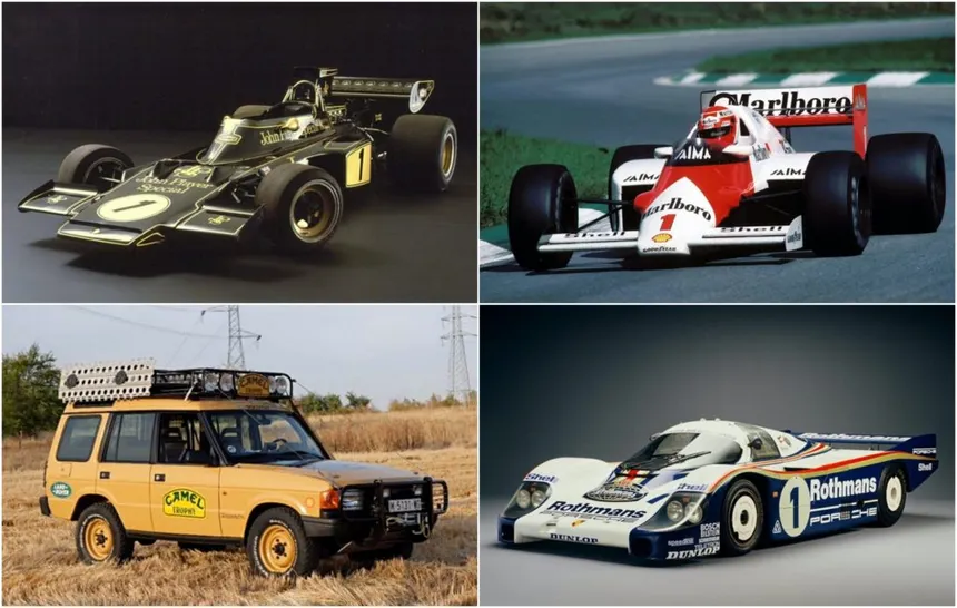
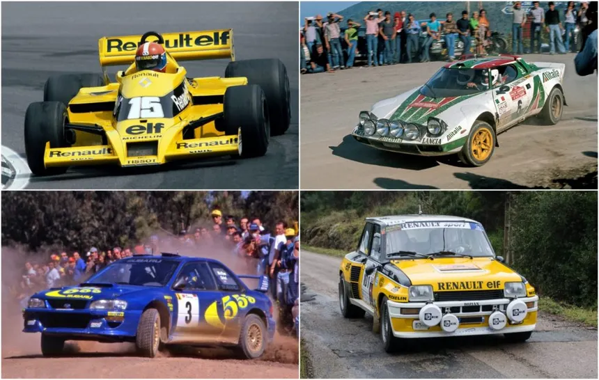
That system lasted until 1968, when Colin Chapman slapped Gold Leaf cigarette colours on his Lotus 49 and proved that colour could sell something other than patriotism. What Chapman demonstrated at Monaco that May, the rest of the paddock understood within five years. National racing colours vanished from the grid. Only Ferrari kept the red, not out of loyalty to the system but because the red had already become bigger than the country it represented. The Rosso Corsa was no longer Italy’s colour. It was Ferrari’s.
Everything that came after was built on the principle Chapman demonstrated that weekend: colour is not heritage. Colour is commerce. And what followed was the most powerful visual branding operation in the history of sport.

The Silver Arrows: A Ninety-Year Colour Built on a Fabricated Story
Mercedes has raced in silver for ninety years. Ninety. No other colour in the history of motorsport has maintained that continuity. Not Ferrari’s red, which has shifted shade by decade. Not British Racing Green, which vanished from the grid when the sponsors arrived. Mercedes’ silver is the longest-running constant in the sport.
And its official origin story is almost certainly a fabrication.
The version Mercedes has been telling since 1958 goes like this. In June 1934, the new W25 was weighed before the Eifelrennen at the Nürburgring and came in one kilogram over the 750 kg limit. Racing manager Alfred Neubauer and driver Manfred von Brauchitsch spent the night scraping off the white lead-based paint. The next morning, the bare aluminium gleamed silver. Von Brauchitsch won the race. The Silver Arrow was born.
German journalist Eberhard Reuss dismantled it forensically. The 1934 Eifelrennen was run under Formule Libre regulations — there was no weight limit to meet. Auto Union also entered three silver cars that day. Von Brauchitsch had already raced a streamlined silver SSKL at the AVUS in 1932, and live radio coverage had already coined the Silver Arrow name two full years before the supposed origin. Neubauer himself wrote a book in 1951 discussing the 750 kg formula without mentioning the paint-scraping incident. The story first appeared in his 1958 memoirs — the same memoirs that included other fabricated tales, including a manufactured conspiracy about the 1933 Tripoli Grand Prix.
But here is the branding lesson. The lie worked better than the truth. The truth is that unpainted aluminium was lighter and more practical — a rational engineering decision. The lie is that a last-minute crisis produced an accidental masterpiece. Which one do you remember? Which one do you tell in the pub? The myth built the asset. Mercedes knows this. That is why they have never publicly corrected it. That is why every time they unveil a new F1 car, the silver is there, connecting 2026 to 1934 through an unbroken chromatic line that no other manufacturer can replicate. Ninety years of the same colour, sustained by a story that never happened. That is branding at a level most companies will never reach.
Gulf: The Brand That Stopped Spending and Kept Earning
What Chapman opened with Gold Leaf, Gulf turned into a commercial empire that is still generating money half a century after closing the till.
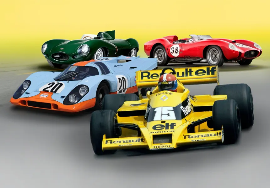
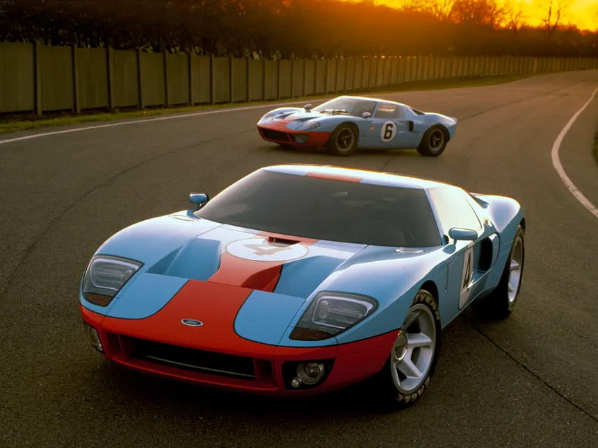
Gulf Oil partnered with John Wyer’s team to campaign a Ford GT40 in 1967. The original livery was dark blue with a marigold stripe — workmanlike, functional, forgettable. Then someone in Gulf’s branding department made a decision worth tens of millions in future licensing revenue: switch the dark blue to powder blue, keep the orange stripe, and create a contrast so striking that the human eye cannot look away.
The powder-blue-and-orange GT40 won Le Mans in 1968 and 1969. The Porsche 917 in the same colours became the star of Steve McQueen’s Le Mans film in 1971. And then Gulf largely stopped sponsoring motorsport. That was the 1970s.
It is now 2026. Gulf has not funded a serious factory racing programme in half a century. Yet the livery continues to print money. McLaren sold special Gulf editions. Porsche runs Heritage programmes with the colour scheme. Aston Martin has used it. Williams currently carries it. There are Gulf-liveried scale models, T-shirts, trainers, phone cases, posters, and art prints generating revenue for a brand that walked away from the paddock two generations ago.
Name another marketing investment — in any industry, in any medium — that delivers commercial returns fifty years after you stopped spending. You cannot. Because nothing else works like colour in motorsport.
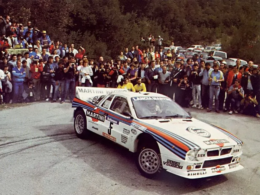
Martini Racing: Three Stripes That Need No Logo
Gulf works through colour contrast — two colours, instantly recognisable. Martini works through pattern. The dark blue, red, and pale blue stripes on a white background form a combination so distinctive that you can reduce it to three lines and the brain still completes the identification.
Consider what that means in branding terms. Nike needs the swoosh. Apple needs the apple. Coca-Cola needs the script. Martini needs three lines of colour. No wordmark. No symbol. No icon. Just a pattern. In the entire history of commercial branding, there are perhaps five identities on earth that function at that level of abstraction. One of them belongs to a vermouth company that decided to sponsor racing cars in the 1960s.
The stripe has appeared on Lancias, Porsches, Brabhams, Williams cars, Alfa Romeos. It has crossed from rallying to Le Mans to Formula One and back again across six decades. The Porsche 935 Martini, the Lancia Delta Integrale Martini, the Williams FW with Mansell and Piquet — these are cars from entirely different eras and disciplines that share the same instant visual identity.
And here is the fact that should haunt every brand manager. The Martini stripe is the most imitated livery in the history of motorsport. Thousands of private cars, weekend builds, custom wraps, vinyl kits from every corner of the internet — all copying three stripes that belong to an Italian drinks company. Martini does not pursue them. Every imitation reinforces the original. Every copy is free advertising.
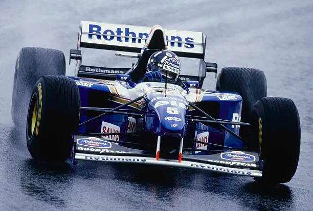
Rothmans: The Elegance That Legislation Killed
If Marlboro was power and JPS was luxury, Rothmans was elegance. The white-and-dark-blue with gold detailing was probably the most sophisticated livery in motorsport history. And it vanished overnight because a legislator decided cigarettes could no longer appear on racing cars.
The Porsche 956 and 962 in Rothmans colours dominated Le Mans through the 1980s. The Williams FW11 of Mansell and Piquet — yes, the same drivers who later raced in Martini — carried Rothmans during one of the most competitive eras in F1. Mick Doohan’s Honda NSR500 in MotoGP wore the same white and blue, making every bike look as though it had been designed by a Swiss watchmaker.
What Rothmans demonstrates from a brand perspective is what happens when a colour does not have time to mature. Gulf had two decades to embed its livery in collective memory before leaving the paddock. Rothmans had fifteen years. That was enough to create a recognisable visual identity, but not enough to turn it into an asset that survived without support. Today, the Rothmans blue and white is recognised by people who were there. It is not universal like Gulf or Martini. It is generational. And that tells you that the power of a colour depends not only on the quality of the design but on the time it has to cook in people’s heads.
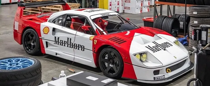
Marlboro: The Colour That Ate Two Brands
Marlboro’s story in motorsport is a cautionary tale dressed as a triumph. It is the story of a sponsor that became so visually dominant that its colour merged with the team’s identity — and then the team kept the colour after the sponsor left.
Marlboro entered Formula One with BRM in 1972, moved to McLaren in 1974, and stayed until 1996. The red-and-white Marlboro McLaren is probably the most photographed Formula One car in history. The MP4/4 of Senna and Prost in 1988 — fifteen wins from sixteen races — was not just a dominant machine. It was a visual icon that defined an entire generation. Murray Walker screaming over a red-and-white McLaren is as central to British sporting memory as any Wembley goal.
Then Marlboro moved to Ferrari. And here is where colour did something extraordinary. Marlboro red and Rosso Corsa were different shades, but close enough that they fused in collective visual memory. When tobacco advertising restrictions forced Marlboro to reduce its branding — first to the infamous barcode, then to near-invisibility — nobody noticed, because the red was already Ferrari. The sponsor had funded the association for so long that the sponsor’s colour and the team’s colour had become indistinguishable.
The question that deserves answering is whether this was good or bad for Marlboro. In terms of raw exposure, it was a triumph. Marlboro red became the most-seen colour in the most global sport on earth for thirty years. But in terms of brand ownership, it was a quiet disaster. Marlboro invested hundreds of millions building a chromatic association, and when legislation barred their name, Ferrari kept the colour for free. The red on a modern Ferrari F1 car is neither pure Rosso Corsa nor Marlboro red. It is a hybrid of decades of visual coexistence. And the entity that profits from that hybrid is Ferrari, not Philip Morris. Marlboro paid for the paint for thirty years and the brand that kept it was the one with the car underneath. That is the real nightmare for any marketing director: building a visual asset so powerful that it transcends your brand, merges with another, and can never be reclaimed.
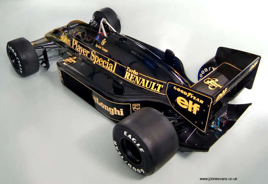
JPS: The Colour That Should Not Have Worked
Before 1972, Formula One cars were not black. Black was a non-colour in racing — associated with funeral cars, road saloons, everything that was not speed. Then John Player Special put its black-and-gold livery on the Lotus 72 and broke every assumption the sport had about what a racing car should look like.
The JPS Lotus was not accidentally beautiful. It was a statement of luxury imported into a sport that had always associated speed with primary colours. The contrast between deep black and metallic gold was sophisticated, adult, premium. It was a racing car that looked like a Cartier watch. Fittipaldi won the championship in it in 1972. Peterson was runner-up in 1973. The ground-effect Lotus 78 and 79 in black and gold remain, for many designers, the most beautiful single-seaters ever built. Ask anyone at Pininfarina or Zagato which racing car they would hang on their studio wall and the JPS Lotus will be in the conversation.
Fifty years later, when McLaren ran a dark livery, fans immediately connected it to the JPS Lotus. A tobacco sponsor that vanished from circuits decades ago still owns a colour in the collective memory of the sport.
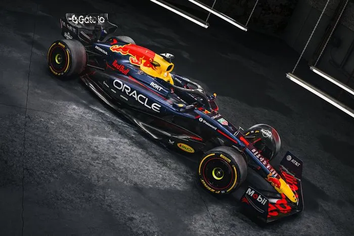
Red Bull: When Colour Is Not Sponsorship but Colonisation
Every case above involves a sponsor placing its colour on someone else’s car. Red Bull did something entirely different. It bought the teams. And painted them its colour.
Jaguar Racing became Red Bull Racing in 2005. Minardi became Toro Rosso. Then Alpha Tauri. Then Racing Bulls. In MotoGP, KTM. In rally raid, in cliff diving, in everything with an engine, wings, or adrenaline. Red Bull did not negotiate space on someone else’s bodywork. It bought the bodywork and covered it in the dark blue, red, yellow, and twin bulls that were already in your head before you started reading this sentence.
That is not sponsorship. It is chromatic colonisation. And it operates on an entirely different branding logic to Gulf or Martini. Gulf built its visual identity through association with winning cars. Red Bull built its through ownership of the entire ecosystem. You do not need people to remember a specific Red Bull car. You need people to be unable to look in any direction in sport without seeing those colours. Total saturation. It is the difference between hanging a painting on a wall and buying the wall.
Repsol Honda: The Gulf of Two Wheels
Repsol has sponsored Honda’s MotoGP team for over thirty years. The orange, red, and white of Repsol Honda is to motorcycles what Gulf is to Le Mans cars — a colour scheme that has transcended sponsorship to become pure identity.
Marc Márquez won six MotoGP titles in those colours. Mick Doohan won five before him. Three decades of intermittent domination in the same orange livery on the same factory machine. At this point, strip the Repsol colours from a Honda MotoGP bike and it looks naked. Incomplete. Like a white Ferrari — technically correct, emotionally wrong.
The proof that the fusion between sponsor and team is real came when Márquez left for Ducati. People did not say “Márquez left Honda.” They said “Márquez left Repsol Honda.” The sponsor is part of the name. Not the fairing. The name.
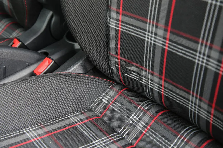
The GTI Tartan: When Colour Is Not Paint
This is the part that most analyses of colour in the automotive industry miss entirely. Colour as brand identity does not live only on the bodywork. It lives on any surface the eye can associate with a product. And sometimes the most powerful surface is the one you sit on.
The Volkswagen Golf GTI has carried a tartan upholstery — the Clark plaid, as it is known to upholstery obsessives and GTI devotees — since the Mark 1 in 1976. You do not need to see the VW badge. You do not need to see the GTI lettering. You do not even need to be outside the car. You sit down, you look at the seat cloth, and you know exactly where you are.
That tartan is a brand asset as powerful as Ferrari’s red or Gulf’s livery, but it operates in an entirely different sensory space. It is not a colour you see at two hundred metres on the Mulsanne Straight. It is a colour you feel when you sit down. It is intimate. Personal. And that is why it works in a way no exterior livery can replicate.
Volkswagen understands this. Every generation of the GTI has kept the tartan with minor variations — the pattern evolves, the weave changes, but the structure remains: check, red, black, cloth. Every time a designer has suggested replacing it, the market has delivered the same answer. Do not touch the tartan. It is the interior equivalent of “do not touch Ferrari’s red.” The Clark plaid has become so iconic that aftermarket companies sell reproduction fabric by the metre. People upholster furniture in it. It appears on trainers, bags, and phone cases. A seat fabric pattern from a 1976 hot hatchback has become a standalone commercial asset.
And VW is not alone. The houndstooth Pepita pattern on certain Porsche 911 interiors. The bicolour Recaro shells in BMW M Sport seats. The red leather of a Mercedes-AMG cabin. These are colours that function as brand signatures without requiring a logo. The eye reads the colour, the brain supplies the brand. No text needed.
Kawasaki: The Green That Rode Down from the Track
Kawasaki did not choose lime green for its motorcycles through a branding strategy workshop. The green was born on motocross and superbike tracks and migrated to the road range because customers associated it with speed. A Kawasaki Ninja in green on any high street in the world is instantly identifiable, and that association was forged on a racing circuit half a century ago.
But the interesting thing about Kawasaki is the mechanism. No marketing department decided “our colour will be green.” Customers started requesting green because they had seen it win. The colour migrated from competition to the street through popular demand, not corporate directive. And that makes it more robust than any colour chosen in a boardroom, because it needs no explanation and no launch campaign. People already know what it means.
Subaru: The Sponsor That Paid for the Colours and Lost Ownership
The Subaru case is one that branding textbooks should study — but from the wrong end.
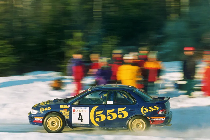
The blue and gold of the Impreza WRC was not a Subaru colour. It was the livery of 555, the British American Tobacco cigarette brand that sponsored the team from 1993. Colin McRae winning in Catalonia, in Greece, in New Zealand — always in 555 blue with gold wheels throwing dirt behind. Richard Burns. Petter Solberg. An entire generation of champions associated with a colour scheme that belonged to a tobacco company.
When anti-tobacco legislation removed 555 from motorsport, Subaru kept the colours. Not the sponsor’s colours. The team’s colours. Because those colours had already become Subaru in the minds of millions. The sponsor paid for the colour combination and the brand kept it permanently, for free. The pearl blue you can order on a WRX today traces directly back to a tobacco sponsorship deal from the 1990s that no longer exists. McRae’s blue and gold no longer belongs to 555. It belongs to every kid who had a poster of a mud-splattered Impreza on their bedroom wall.
Colour in Japan: When Culture Changes Everything
Japan deserves its own section because it demonstrates that the relationship between colour and brand works entirely differently depending on the culture.
Honda adopted white with the red disc of the rising sun as its competition colour in the 1960s, directly from the national flag. It was a potent scheme — clean, immediately identifiable. But Honda never treated it as an exclusive brand asset. They used it in F1, abandoned it, recovered it, abandoned it again. For Honda, the competition colour was functional, not identitarian. What mattered was the engine, not the paint. Engineer’s mentality.
Yamaha did the opposite. The Yamaha blue in MotoGP has been maintained with a consistency that mirrors Mercedes’ silver. Rossi, Lorenzo, Quartararo — the details change with sponsors, but the base blue remains. Yamaha understood that colour builds competition identity and protected it for decades. When you think of MotoGP, the Yamaha blue is as automatic as Ferrari red in F1.
And then there is Nissan, which played the game differently. The metallic blue of Calsonic on the Skyline GT-Rs of the JGTC is one of the most beloved colours in JDM culture. But it was not a Nissan colour — it was a sponsor colour, just like Subaru’s 555. The difference is that Nissan never claimed it for the road. The Calsonic blue lives in scale models, in video games, in fan culture, but not in the Nissan catalogue. It is an orphan colour — too famous to forget, too external to claim.
Colour Today: Are Icons Still Being Made?
Every major case examined so far was born between the 1960s and 1990s. Gulf, Martini, JPS, Marlboro, Rothmans, Repsol, 555 — all children of the great tobacco and petroleum sponsorship era. The question that matters is whether the phenomenon is still happening or whether the age of iconic colours has passed.
The answer is that it is still happening, but differently. It is no longer a sponsor building an iconic colour. It is the manufacturers themselves reclaiming their competition colours to differentiate in a road-car market where everything is black, grey, and silver.
McLaren’s papaya orange is the clearest case. Bruce McLaren chose it because he liked it, not because of any New Zealand racing tradition. It disappeared for decades under Marlboro, West, and Vodafone liveries. When McLaren recovered it in 2017, it was like finding a five-hundred-pound note in an old coat. The colour had been sitting there, loaded with history, untouched. Today, papaya orange is McLaren in the same way that red is Ferrari, and it is in the process of becoming an icon of comparable stature.
Aston Martin’s green is another. When Aston returned to F1 in 2021, green was not an option. It was an obligation. It is the thread connecting the DBR1s at Le Mans in the 1950s with the cars of Alonso and Stroll. Without that green, Aston Martin in F1 would be another brand with a nice name. With that green, it is the direct heir of Stirling Moss and Carroll Shelby.
And in MotoGP, Ducati’s matte red is in the middle of crystallising. It is not Ferrari red — it is darker, more aggressive, dirtier. It is the red of a company that builds motorcycles that sound like earthquakes and ride like they have a demon inside. Bagnaia won two titles in that red. Márquez switched to that red. If Ducati maintains the consistency for another decade, that red will be to two wheels what Rosso Corsa is to four.
The Invisible ROI: Why Colour Always Wins
If you analyse colour as a marketing asset using standard metrics — cost of acquisition, frequency of exposure, unaided recall, lifetime value — the numbers make no sense. They are too good. They do not fit any other channel.
A sponsor that places its colour scheme on a Formula One car for ten years purchases something no digital campaign can buy: involuntary memory. The people who saw the Marlboro McLaren in 1988 remember it even if they do not smoke and even if they have not watched Formula One since. Colour works on the subconscious. It does not require conscious attention. It does not require the viewer to read the sponsor’s name. The colour enters through the eye and records itself without permission.
And here is the principle that separates colour from every other element of branding: colour survives the brand. Gulf no longer sponsors. JPS no longer exists as a mainstream cigarette brand. Marlboro cannot put its name on a car. Rothmans disappeared from the circuits. 555 is history. But the colours of all of them are still alive. Still selling. Still the first image that appears when someone thinks of Le Mans, the Lotus 72, Senna’s McLaren, or McRae’s Impreza. The logo disappears. The name fades. The colour stays.
Colour is not the final detail in the design of a racing car. It is the first strategic asset of any brand that wants to survive more than one generation in the public memory. It is the first thing you see and the last thing you forget. And in a sport where everything changes every season — drivers, engineers, regulations, sponsors — colour is the only thing that remains.
Check you’re still alive.