
The Biscione: Why Alfa Romeo Still Wears a Snake Eating a Man
Walk past a parked Alfa Romeo. Lean in and look at the badge. What you’ll see, on every Giulia, every Stelvio, every Tonale, every 4C, every Junior, every old Spider parked in a Surrey driveway, is a blue serpent wearing a crown, devouring a red human figure. Not breathing fire. Not blowing smoke. Eating a man. The man’s body still protruding from the snake’s mouth.
That image has lived on the radiator grille of a road car since 1910. Through two world wars, three Italian regimes (kingdom, fascist dictatorship, republic), state ownership, near-bankruptcy, sale to Fiat, sale to Stellantis. Through the entire arc of modern automotive design. And nobody at the company has ever blinked. While Mercedes flattens the three-pointed star into a geometric ghost. While BMW dissolves the propeller roundel into a transparent ring. While Cadillac eliminates the heraldic crest. While Volkswagen reduces VW to a single line. While Audi accepts that almost nobody remembers the four rings stand for a 1932 merger.
Alfa Romeo still has a snake eating a man. And the longer you look at that fact, the more interesting it becomes.
This is the story of how a medieval Lombard coat of arms ended up on a car badge, why three competing legends explain where it came from, and why a serpent devouring a human figure has outlived almost every clean modernist logo around it.
Three versions of one violent legend
The biscione is not Alfa‘s. It belongs to the House of Visconti, the aristocratic dynasty that ruled Milan from 1277 to 1447 — one hundred and seventy years of medieval Lombard hegemony, before the family line ran out and the symbol was inherited, along with the duchy, by the Sforza family through marriage. Francesco Sforza married Bianca Maria Visconti, the last duke’s daughter, and the serpent carried on.
Where did the Visconti get it? Three legends compete, none of them documented in the sense a modern historian would accept, but all of them rehearsed in Italian heraldic literature for seven hundred years.
The Saracen version. The dominant medieval account, written down by the Dominican chronicler Galvano Fiamma in the fourteenth century (his Chronicon extravagans) and earlier by Bonvesin de la Riva in 1288 (De magnalibus urbis Mediolani), places the origin during the Crusades. Ottone Visconti, the founding figure of the dynasty, supposedly dueled and killed a Saracen warrior at the gates of Jerusalem. The defeated Saracen’s shield bore the image of a blue serpent devouring a red Saracen figure. Ottone, in the medieval tradition of taking the symbols of those you’ve killed in battle, claimed the device for his own family.
The historical problem with this story is that the real Ottone Visconti lived from 1207 to 1295 and never fought at Jerusalem. The legend telescopes two centuries of Lombard military history into a single duel for narrative effect. But medieval heraldry wasn’t built from archives. It was built from useful stories. And the useful story here was: our symbol is a trophy taken from an infidel killed in single combat.
The Lake Gerundo version. A folkloric variant locates the legend not in the Holy Land but on Milan’s doorstep. Lake Gerundo was a large wetland east of Milan that existed until the late Middle Ages, when it was gradually drained for agriculture. According to the folk tradition, the lake was haunted by a giant child-eating dragon called Tarantasio. Ottone Visconti killed it, and grateful villagers granted him the right to bear the creature’s image as a coat of arms. This version exists to soften the politics: rather than a Saracen trophy, the badge becomes the proof that a hero protected the local peasantry from a monster.
The Christian child version. And here it gets darker. Some later sources, mostly from the sixteenth century onwards, claim that the original Saracen’s shield depicted not another Saracen but a Christian child being devoured by the snake — a piece of medieval Islamic propaganda mocking the helpless infant Christendom. When Ottone took the shield as a trophy, he inverted the meaning: now the snake’s prey was the Saracen, not the child. The semantic gesture was as violent as the killing it celebrated.
Over the centuries, in heraldic illustrations, the figure being eaten was drawn progressively more child-like and progressively more European, until the original symbolism faded into ambiguity. Today, when you look at an Alfa Romeo badge, you cannot tell whether the snake is eating a child, a Saracen warrior, or some generic adult. Alfa has never officially clarified. The ambiguity is deliberate. To clarify would be to take a political position. To keep it ambiguous is to keep all the weight without any of the controversy.
For what it’s worth, Dante Alighieri mentions the biscione in Canto VIII of the Purgatorio, calling it “the viper that strikes the Milanese.” When Dante puts your coat of arms in the Divine Comedy, you have entered another tier of symbolic gravity. No British marque carries that. Lotus has its founder’s initials. Aston Martin has its wings. Jaguar leaps in chrome. None of them is referenced by name in one of the foundational poems of European literature. That is the league the biscione plays in.
The tram stop, 24 June 1910
The story of how this medieval symbol ended up on a car badge is small, specific, and well documented. In the first half of 1910, A.L.F.A. was being founded in Milan (we covered the company’s birth in a previous piece). The new factory in Portello needed a logo. A young in-house draftsman named Romano Cattaneo was given the brief.
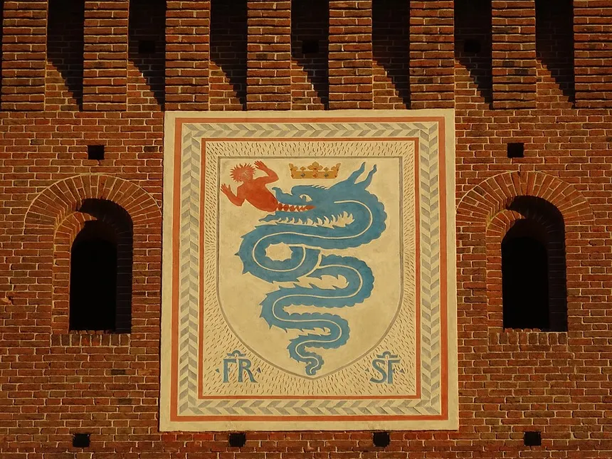
Cattaneo was standing at the Piazza Castello tram stop one morning, waiting for the number 14. He looked up at the Filarete Tower of the Castello Sforzesco, the square gate-tower that dominates the castle’s main entrance. There, mounted on the tower’s architecture, was a heraldic biscione visconteo. Cattaneo stared at it for a long time. By the time the tram arrived he had the idea.
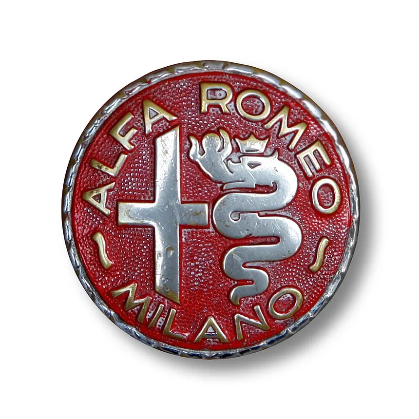
He brought it back to the factory and discussed it with Giuseppe Merosi, the chief engineer (the same Merosi who designed the 24 HP and the 1914 twin-spark Grand Prix engine — for an engineer he had a remarkable feel for visual identity). The two of them worked through several iterations. By 24 June 1910, the date of A.L.F.A.’s legal foundation, the logo was finalised: a circular badge split vertically. Left half: the red cross of Milan on white, drawn from the Comune’s own coat of arms. Right half: the green biscione on a light blue field, devouring a red figure. A dark blue ring around the whole thing, with “ALFA” inscribed at the top and “MILANO” at the bottom, separated by two Savoy knots, deferential nods to the ruling House of Savoy that then governed the Italian kingdom.
There’s a piece of design intelligence here that deserves to be named out loud. Cattaneo could have lifted the biscione from any number of buildings in Milan. It appears on the Duomo, on the Palazzo Reale, on dozens of Visconti and Sforza monuments around the city. He chose the Filarete Tower of the Castello Sforzesco specifically. Two reasons.
First, civic visibility. In 1910 the Castello was Milan’s most famous monument for the man in the street. It had been restored at the end of the nineteenth century by Luca Beltrami, the celebrated Lombard architect, and was the city’s pride of place. Every Milanese knew the Filarete Tower. To take the biscione from there was to take it from the most recognisable bit of public Milan.
Second, mixed legitimacy. The Castello belongs to both Visconti and Sforza memory. Taking the symbol from the Castello rather than from a purely Visconti residence subtly democratised it. The biscione became Milan’s, not just the dynasty’s. That ambivalence carried over into the logo’s composition: cross on the left for the civic Milan of the Comune; serpent on the right for the aristocratic Milan of the medieval lords. Two halves, two Milans, one round badge. That is not decoration. That is heraldic argument compressed into a circle 40 millimetres across.
If the logo had been designed by a committee of marketing executives in 1910 it would have looked nothing like that. The fact that it was designed by an in-house draftsman and an engineer waiting for a tram is the reason it has aged so well.
A century of small changes
The 1910 badge isn’t the 2026 badge. Alfa’s logo has been revised at least ten times. Each revision is a fingerprint of its decade. Walk through them and you walk through Italian twentieth-century history.
1915, Romeo. When Nicola Romeo acquires A.L.F.A. (the subject of the last piece in this series), the wordmark changes from “ALFA” to “ALFA-ROMEO” with a hyphen. Outlines tighten. Small change, big signal: the marque now has a man’s surname attached to it.
1925, the laurel of the P2. When Vittorio Jano‘s P2 wins the inaugural World Manufacturers’ Championship in August 1925, beating the Bugatti Type 35s and forcing the all-conquering Fiat racing team to withdraw from grand prix racing forever, Alfa Romeo adds a silver laurel wreath around the badge. The classical Roman victor’s crown applied to a Milanese coat of arms. Diameter increases to 75 mm, later trimmed to 60 mm in 1930. This is probably the most recognisable variation of the twentieth century. Any pre-war Alfa you see today wearing a laurel wears it because of one race weekend at Monza.
1933, the gold of the IRI. Here’s the paradox. The moment the Italian state takes financial control of Alfa through the IRI, stripping the company of its independence, the laurel changes from silver to gold. Letters and cross enlarge. The logo becomes more imposing, more imperial, more deliberately impressive — at exactly the moment the company has lost its financial autonomy and become an instrument of Mussolini’s industrial policy. The visual gets richer as the politics get worse. The symbol always tells the truth, even when the context contradicts itself.
1945-1946, the Savoy fall. When Italy holds the constitutional referendum of 1946 and votes to abolish the monarchy, the House of Savoy is exiled, and the kingdom becomes a republic. The two Savoy knots that had separated “ALFA” from “MILANO” since 1910 are quietly replaced with two neutral wavy lines. Tiny visual change, enormous political signal: the marque distances itself from the defeated royal house. Coincides with a period of acute material shortage — Portello had been bombed and the emblem-stamping presses themselves were partly destroyed — so the simplification was both political and practical.
1947 and 1948. Brief experiments with red and yellow palettes, then a return to the traditional colours with thicker outlining and a more prominent red on the human figure.
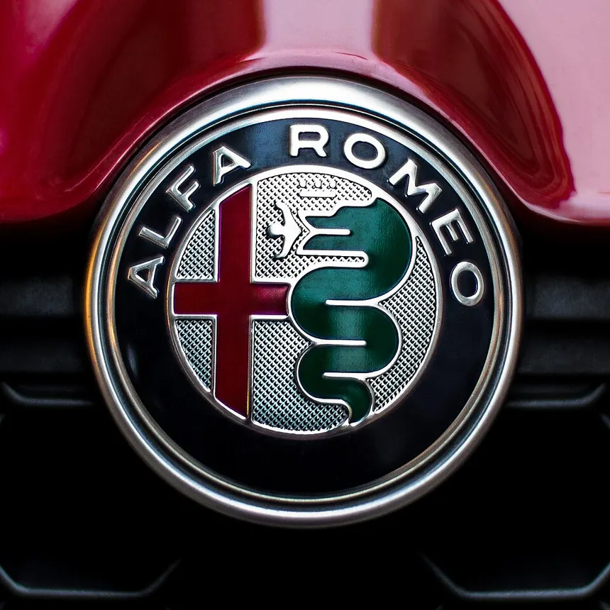
1972, the loss of MILANO. When Alfa opens the Pomigliano d’Arco plant near Naples in 1971 to build the Alfasud, the marque is for the first time built outside Milan. The geographic claim of “MILANO” on the badge stops making literal sense. In 1972 the word is dropped, the wavy lines disappear, the hyphen in “Alfa-Romeo” goes, and the logo becomes geometric, cleaner, more modern. The man being eaten is redrawn in a more intense red — to the point that many modern viewers, unaware of the heraldic origin, assume the snake is breathing fire or sticking out a three-pronged tongue.
1982, Futura. The wordmark is redrawn in Futura, the geometric sans-serif designed by Paul Renner in 1927 — one of the most-used typefaces of the twentieth century. Accents go gold. The laurel disappears for good. Diameter increases. The logo enters its mature corporate phase.
2000, the gradient era. Gradient shades appear in the background to give the badge digital “depth” for screens. The serpent’s crown is refined. This is the badge most younger British and American Alfisti grew up with, on cars like the 156 GTA and the Brera.
2015, Robilant Associati. The current logo, launched with the new Giulia at Alfa’s 105th anniversary celebration at the Museo Storico in Arese. Designed by Milan studio Robilant Associati. Gold gives way to silver. The vertical line separating cross from biscione is removed — the two heraldic halves now flow into each other. Flat design for the mobile-first era. And yet, critically, the snake still eats the man. They didn’t sanitise it. They didn’t abstract it. They didn’t replace the figure with a flower (as Berlusconi’s Fininvest did with its own biscione variant). They left the medieval violence intact.
In 2015, that was a decision.
Why Alfa hasn’t softened it
Look at what the other premium brands have done with their logos in the last decade. Mercedes deflates the star into a flat geometric pictogram. BMW renders the roundel almost transparent for “openness.” Volkswagen reduces VW to a single ribbon line. Cadillac strips the heraldic crest down to two letters in a rectangle. Renault redraws the lozenge as a hollow folded ribbon. Even Lamborghini and Bugatti have flattened their crests and lions. The industry trend is unmistakable: remove narrative, remove depth, remove anything that could chafe against a contemporary sensibility. Logos optimised for app icons and Instagram filters.
Alfa Romeo has gone the other way. Its 2015 redesign kept every element of medieval narrative intact: the crowned serpent, the human figure being devoured, the civic cross. The only things ever removed in 115 years have been the political markers (Savoy knots, MILANO geography) that stopped applying for external reasons. The heraldic core hasn’t moved.
Why? Three reasons worth thinking about, because no one really articulates them.
One: Alfa knows that symbolism is active, not decorative. A serpent devouring a man is not the same as four interlocking rings. It has a story, a history, a friction. Friction generates conversation. People ask what the badge means. That is passive marketing that no abstract logo can deliver.
Two: Alfa is a brand for the initiated. The word Alfista (the Italian term for a committed Alfa Romeo owner) is functionally a tribal identifier. Alfisti value provenance, lineage, story. They don’t want a Tesla-style modernist logo. They want a badge with weight that they can explain to a younger relative. If Alfa flattens the biscione, it loses the Alfista — and the Alfista is the customer who actually pays the premium that justifies the marque’s existence.
Three, and this matters to anyone who works with their hands: symbols behave like mechanical parts. A symbol designed with margin — with history, with redundancy, with weight — survives a century of use. A symbol designed without margin — slick, abstract, fashionable — breaks at the first change of design trend. The biscione has seven centuries of margin baked in. It is the heraldic equivalent of the over-engineered four-cylinder monobloc that Merosi cast for the 1910 24 HP: oversized for what it has to do, built to last regardless of weather.
What I see when I stop and look
I work in industrial assembly and the lesson of my working life is that the parts that survive are the parts that were over-designed at the beginning. The same applies to symbols. The Milan cross is four lines saying “city.” The biscione is a serpent eating a man saying “dynasty that takes what it kills.” Combine them in a circle and you say “we are Milan in both halves, the civic and the aristocratic, the people and the powerful.” That is a logo designed with margin.
What bothers me about the recent wave of luxury-brand redesigns is the premise that digital screens require flat symbols. They don’t. Digital screens require memorable symbols. And memorability is built from narrative, not geometry. Fifty years from now nobody will be able to remember the Renault redesign of 2021, because there’s no story behind a folded ribbon. But there will still be children asking what that little figure is, sticking out of the snake’s mouth on the front of their parent’s Alfa. And somebody will have to tell them about Voluce the Saracen, about Ottone Visconti at the gates of Jerusalem, about Cattaneo standing at a tram stop in 1910, about Merosi locking the design in the Portello workshop, about Lake Gerundo and the dragon that ate the village children.
That is what a symbol that lasts looks like. Not pretty. Not friendly. Not optimised. Violent, medieval, ambiguous, controversial — and precisely because of that, alive when most of its modernist contemporaries have dissolved into geometric ghosts on mobile app icons.
The biscione is the proof that when you build a symbol with serious heraldic intelligence, it survives the centuries. When you build it for the next quarterly design review, it survives three fiscal years.
Look at the next Alfa you see in traffic. Tell whoever’s sitting next to you that the red man sticking out of the snake’s mouth has been in Milan for seven hundred years. And that the brand, in a hundred and fifteen years of automobiles, has never had the nerve to take him out of there. Because it knows what it would lose.
Check you’re still alive.